OPP
Client
ihärdig
Services
Branding, Print, Marketing
Year
2025
Studio
Independent

Case study
A week of talking each other up in Bergen.
Description
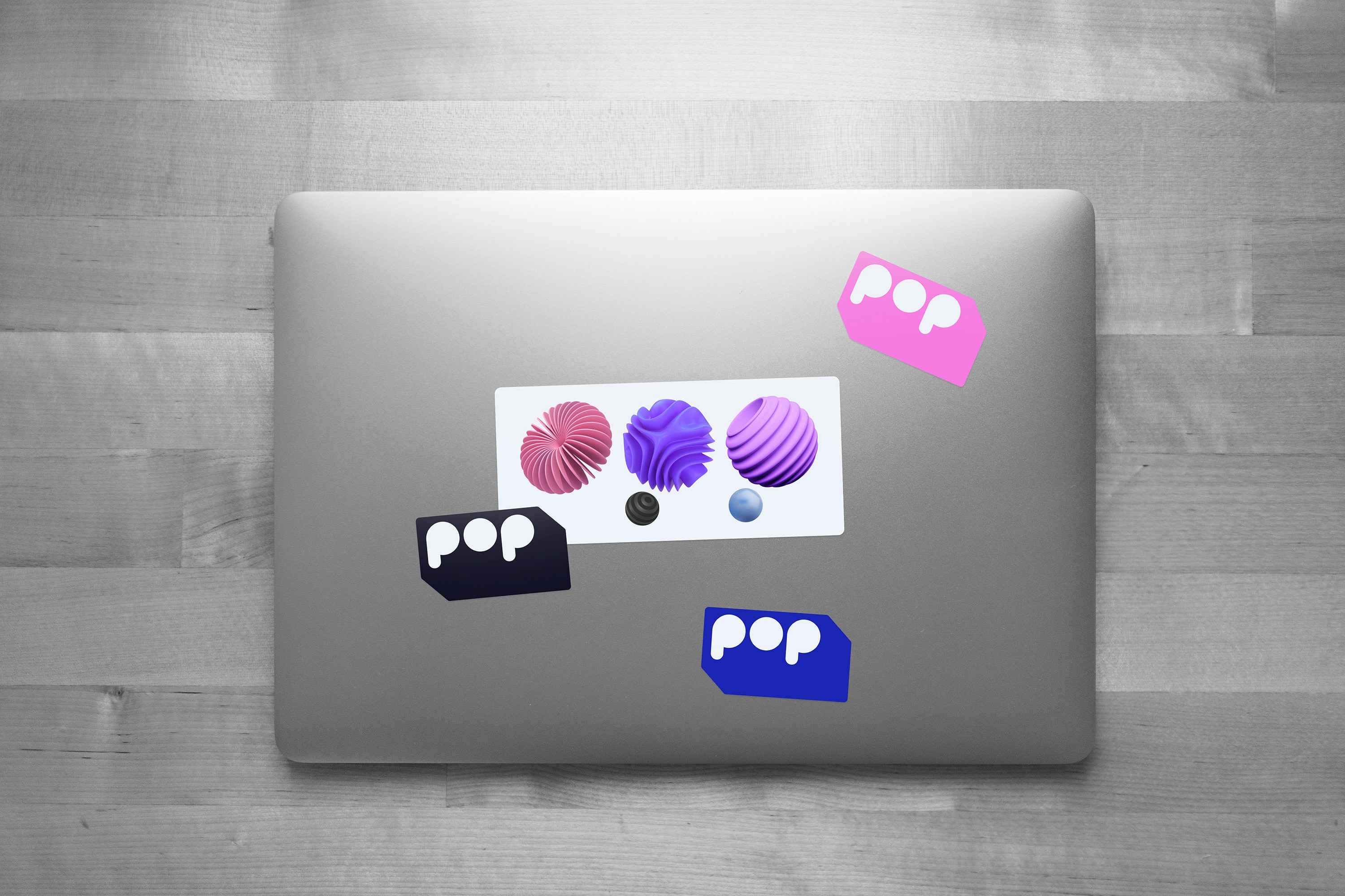
Innovasjonsuken OPP is Vestlandet's innovation festival, a week of talks and meetups across Bergen every September. The logo was drawn by someone else and had to stay. Everything else was up to me. The shapes are 3D, spheres, like planets seen from far off. The colours are 80s vaporwave, magenta and purple over a near-black. It's the future without a rocket or a grid of glowing lines. Ingen fremtid uten fremdrift sits at the bottom of everything. No future without momentum.